Code
pip install -U scikit-learn
pip install -U kaggle
pip install -U kagglehubA comprehensive guide to classification metrics in Python, covering concepts like sensitivity, precision, AUROC, and F1-score with practical code examples.
This document provides a comprehensive guide to understanding and implementing various classification metrics in Python. It covers key concepts such as sensitivity, precision, AUROC, accuracy, F1-score, and specificity. The guide includes practical code examples that walk you through the entire process, from installing the necessary packages and loading data from Kaggle to training a logistic regression model and visualizing the results with a confusion matrix and ROC/PR curves. This is an essential resource for anyone looking to evaluate the performance of their classification models.
Classification Metrics Explained | Sensitivity, Precision, AUROC, & More
pip install -U scikit-learn
pip install -U kaggle
pip install -U kagglehubimport matplotlib.pyplot as plt
import numpy as np
import os
import pandas as pd
import seaborn as sns
#from kaggle.api.kaggle_api_extended import KaggleApi
from sklearn.model_selection import train_test_split
from sklearn.linear_model import LogisticRegression
from sklearn.metrics import (
precision_score, recall_score, roc_curve,
accuracy_score, f1_score, roc_auc_score,
average_precision_score, confusion_matrix,
precision_recall_curve
)import kagglehub
# Download latest version
kagglehub.dataset_download("uciml/pima-indians-diabetes-database")
path = kagglehub.dataset_download("uciml/pima-indians-diabetes-database")
print("Path to dataset files:", path)Warning: Looks like you're using an outdated `kagglehub` version (installed: 0.3.10), please consider upgrading to the latest version (0.3.12).
Warning: Looks like you're using an outdated `kagglehub` version (installed: 0.3.10), please consider upgrading to the latest version (0.3.12).
Path to dataset files: /Users/jinchaoduan/.cache/kagglehub/datasets/uciml/pima-indians-diabetes-database/versions/1show data file under download folder
import os
os.listdir(path)['diabetes.csv']df = pd.read_csv(path+'/'+os.listdir(path)[0])
df.head()| Pregnancies | Glucose | BloodPressure | SkinThickness | Insulin | BMI | DiabetesPedigreeFunction | Age | Outcome | |
|---|---|---|---|---|---|---|---|---|---|
| 0 | 6 | 148 | 72 | 35 | 0 | 33.6 | 0.627 | 50 | 1 |
| 1 | 1 | 85 | 66 | 29 | 0 | 26.6 | 0.351 | 31 | 0 |
| 2 | 8 | 183 | 64 | 0 | 0 | 23.3 | 0.672 | 32 | 1 |
| 3 | 1 | 89 | 66 | 23 | 94 | 28.1 | 0.167 | 21 | 0 |
| 4 | 0 | 137 | 40 | 35 | 168 | 43.1 | 2.288 | 33 | 1 |
df.Outcome.value_counts()Outcome
0 500
1 268
Name: count, dtype: int64# separate features from response
X = df.drop('Outcome', axis=1)
y = df['Outcome']# split data into test and training sets
X_train, X_test, y_train, y_test = train_test_split(X, y, test_size=0.2, random_state=42)# initialize and train logistic regression model
model = LogisticRegression(max_iter=1000)
model.fit(X_train, y_train)LogisticRegression(max_iter=1000)In a Jupyter environment, please rerun this cell to show the HTML representation or trust the notebook.
LogisticRegression(max_iter=1000)
# predict on the test set and get the probas
y_pred = model.predict(X_test)
y_pred_proba = model.predict_proba(X_test)[:, 1] # quickly look at the distribution of the probas
percentiles = np.percentile(y_pred_proba, [5, 25, 50, 75, 95])
percentilesarray([0.03455652, 0.11989883, 0.29954411, 0.64776581, 0.87083353])# generate confusion matrix
cm = confusion_matrix(y_test, y_pred)
plt.figure(figsize=(8, 6))
sns.heatmap(cm, annot=True, fmt='d', cmap='Blues', cbar=False)
plt.title('Confusion Matrix')
plt.xlabel('Predicted Labels')
plt.ylabel('True Labels')
plt.xticks([0.5, 1.5], ['No Diabetes', 'Diabetes'])
plt.yticks([0.5, 1.5], ['No Diabetes', 'Diabetes'], va='center')
plt.show()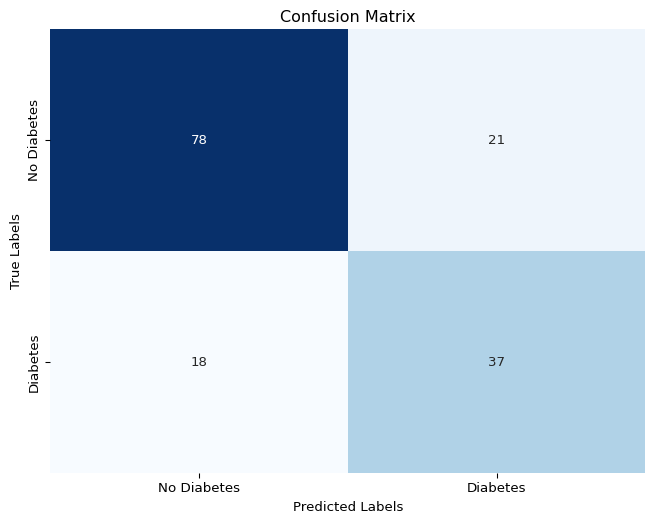
# recall / sensitivity
recall = recall_score(y_test, y_pred)
recall0.6727272727272727# precision / positive predictive value
precision = precision_score(y_test, y_pred)
precision0.6379310344827587# specificity
tn, fp, fn, tp = confusion_matrix(y_test, y_pred).ravel()
specificity = tn / (tn + fp)
specificitynp.float64(0.7878787878787878)# accuracy
accuracy = accuracy_score(y_test, y_pred)
accuracy0.7467532467532467# f1
f1 = f1_score(y_test, y_pred)
f10.6548672566371682# get ROC curve values
fpr, tpr, thresholds_roc = roc_curve(y_test, y_pred_proba)
# get PR curve values
precision, recall, thresholds_pr = precision_recall_curve(y_test, y_pred_proba)
# get areas under the curves
auroc = roc_auc_score(y_test, y_pred_proba)
pr_auc = average_precision_score(y_test, y_pred_proba)# plot both curves
fig, (ax1, ax2) = plt.subplots(1, 2, figsize=(16, 6))
ax1.plot(fpr, tpr, color='darkorange', lw=2, label=f'AUC = {auroc:.2f}')
ax1.plot([0, 1], [0, 1], color='navy', lw=2, linestyle='--')
ax1.set_xlabel('False Positive Rate')
ax1.set_ylabel('True Positive Rate')
ax1.set_title('Receiver Operating Characteristic (ROC) Curve')
ax1.legend(loc="lower right")
# Plot Precision-Recall Curve
ax2.plot(recall, precision, color='purple', lw=2, label=f'PR-AUC = {pr_auc:.2f}')
ax2.set_xlabel('Recall')
ax2.set_ylabel('Precision')
ax2.set_title('Precision-Recall Curve')
ax2.legend(loc="lower left")
plt.show()
y_test.value_counts()Outcome
0 99
1 55
Name: count, dtype: int64https://www.youtube.com/watch?v=KdUrfY1yM0w
https://github.com/RichardOnData/YouTube/blob/main/Python%20Notebooks/classification_metrics.ipynb